Your Iraq Rorshach Test
A week before the election, has there ever been a more graphic example of a political Rorschach Test than the classified CENTCOM Power Point slide "leaked" by the NYT entitled "Iraq: Indications and Warnings of Civil Conflict"?
Aside from the lingering issue whether the NYT is once again helping the enemy hone its offensive strategy, the message that the media draws from the chart -- and wants to convey to others -- is revealing. For the graphic itself seems to comprise a hodge-podge of conflicting assessments and conclusions similar to the previously leaked National Intelligence Estimate on Iraq.
 The NYT, for one, is very clear on what they want readers to infer from the graphic. The online edition actually displays a cropped portion of the chart (left) so that the reader can focus only on an "Index of Civil Conflict" spectrum that runs from "Peace" green on one end to "Chaos" red on the other. From the positioning of arrows along the spectrum, the NYT obviously wants readers to draw the inference that CENTCOM believes Iraq is on the verge of chaos.
If one bothers to click the cropped NYT image, however, the reader will see the entire slide (below). The slide reveals that the Index is a composite drawn from a 14 point factor analysis. Four "Key Reads" and ten "Additional Indicators" comprise the index. Looking at the slide in its entirety is likely to give the reader a different impression than the cropped index.

Among the four "Key Reads" of the analysis, which I assume are the most heavily weighted components of the index, two are marked as in the green "Peace" region, one in the yellow and one orange. Among the ten "Additional Indicators," which I would assume are each given less weight in the index, five are yellow, four are orange, and one is red.
Two things occurred to me when I analyzed the factors one by one and together. First, the color code of each factor on the spectrum comports pretty much with my already formed opinion, but I was pleasantly surprised by the appearance of two Key factors still in the green "Peace" area. Neither was I surprised to see the Additional Indicator "Low level violence motivated by sectarian differences" in red. But on balance I was reassured by the full chart because, as bad as the violence is, it didn't show a broader breakdown in larger elements of Iraqi society that one might associate with all-out civil war or "Chaos."
The second thing that occurred to me is the almost complete disconnect between the composite index and the values of the factors that comprise it. If you were to ask me to eyeball the appropriate placement of the arrow on the index, I would take the four "Key Reads" and average them together and initially place the arrow some where in the green-yellow region. I would then factor in the lower weighted "Additional Indicators." Assuming that the nine yellow and orange factors would largely cancel each other out somewhere near the mid-point of the index spectrum, the cumulative effect would be to pull the arrow marginally rightward. Similarly, adding the single red factor would pull it rightward incrementally.
Nevertheless, I would still mark the final placement of the arrow somewhere to the left of the mid-point of the spectrum. Maybe at the center, but no way inside the "red" zone based on only one red Additional Indicator. I don't know what to make of the difference, and I've asked Mike Gordon of the NYT to explain this seeming disconnect if he can. But in the meantime, it's interesting to read people's reactions.
Some, like Andrew Sullivan and his sympathetic readers look at the chart, specifically the cropped index portion, and throw up their hands and say, see, I told you so, blame the liars and incompetents in the Bush administration for this proof of failure in Iraq. Vote Democrat!
Others, like Mario Loyola at National Review, look at this latest leak of classified information by the NYT a week before the election with suspicion. Beside the leak potentially damaging national security, he thinks the image looks doctored because the classification stamps are missing from the slide. I would also concur that the box containing the index spectrum looks superimposed, along with the comment box which says "Urban areas are experiencing 'ethnic cleansing' campaigns to consolidate control...violence at all-time high, spreading geographically." But I just don't know.
What do you see?
Aside from the lingering issue whether the NYT is once again helping the enemy hone its offensive strategy, the message that the media draws from the chart -- and wants to convey to others -- is revealing. For the graphic itself seems to comprise a hodge-podge of conflicting assessments and conclusions similar to the previously leaked National Intelligence Estimate on Iraq.
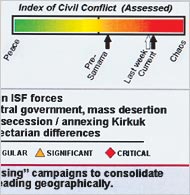 The NYT, for one, is very clear on what they want readers to infer from the graphic. The online edition actually displays a cropped portion of the chart (left) so that the reader can focus only on an "Index of Civil Conflict" spectrum that runs from "Peace" green on one end to "Chaos" red on the other. From the positioning of arrows along the spectrum, the NYT obviously wants readers to draw the inference that CENTCOM believes Iraq is on the verge of chaos.
If one bothers to click the cropped NYT image, however, the reader will see the entire slide (below). The slide reveals that the Index is a composite drawn from a 14 point factor analysis. Four "Key Reads" and ten "Additional Indicators" comprise the index. Looking at the slide in its entirety is likely to give the reader a different impression than the cropped index.
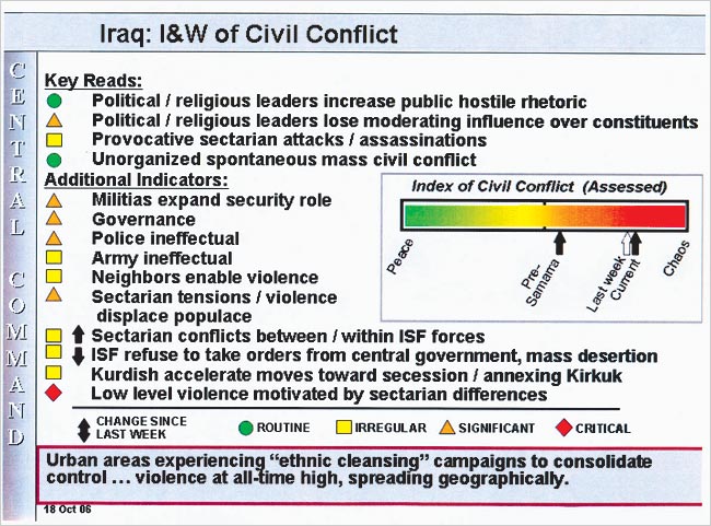
Among the four "Key Reads" of the analysis, which I assume are the most heavily weighted components of the index, two are marked as in the green "Peace" region, one in the yellow and one orange. Among the ten "Additional Indicators," which I would assume are each given less weight in the index, five are yellow, four are orange, and one is red.
Two things occurred to me when I analyzed the factors one by one and together. First, the color code of each factor on the spectrum comports pretty much with my already formed opinion, but I was pleasantly surprised by the appearance of two Key factors still in the green "Peace" area. Neither was I surprised to see the Additional Indicator "Low level violence motivated by sectarian differences" in red. But on balance I was reassured by the full chart because, as bad as the violence is, it didn't show a broader breakdown in larger elements of Iraqi society that one might associate with all-out civil war or "Chaos."
The second thing that occurred to me is the almost complete disconnect between the composite index and the values of the factors that comprise it. If you were to ask me to eyeball the appropriate placement of the arrow on the index, I would take the four "Key Reads" and average them together and initially place the arrow some where in the green-yellow region. I would then factor in the lower weighted "Additional Indicators." Assuming that the nine yellow and orange factors would largely cancel each other out somewhere near the mid-point of the index spectrum, the cumulative effect would be to pull the arrow marginally rightward. Similarly, adding the single red factor would pull it rightward incrementally.
Nevertheless, I would still mark the final placement of the arrow somewhere to the left of the mid-point of the spectrum. Maybe at the center, but no way inside the "red" zone based on only one red Additional Indicator. I don't know what to make of the difference, and I've asked Mike Gordon of the NYT to explain this seeming disconnect if he can. But in the meantime, it's interesting to read people's reactions.
Some, like Andrew Sullivan and his sympathetic readers look at the chart, specifically the cropped index portion, and throw up their hands and say, see, I told you so, blame the liars and incompetents in the Bush administration for this proof of failure in Iraq. Vote Democrat!
Others, like Mario Loyola at National Review, look at this latest leak of classified information by the NYT a week before the election with suspicion. Beside the leak potentially damaging national security, he thinks the image looks doctored because the classification stamps are missing from the slide. I would also concur that the box containing the index spectrum looks superimposed, along with the comment box which says "Urban areas are experiencing 'ethnic cleansing' campaigns to consolidate control...violence at all-time high, spreading geographically." But I just don't know.
What do you see?


0 Comments:
Post a Comment
<< Home